
NomNomNom App
Digital Illustration, Branding, Logotype
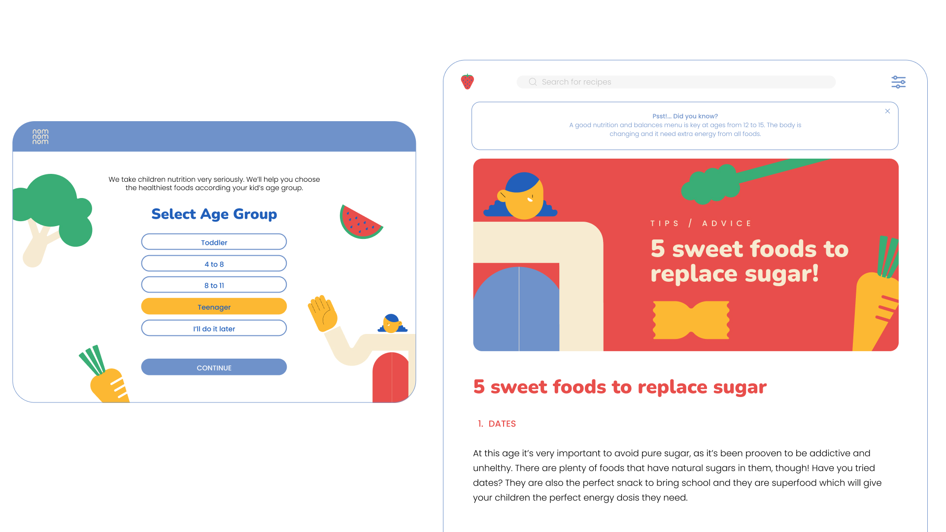
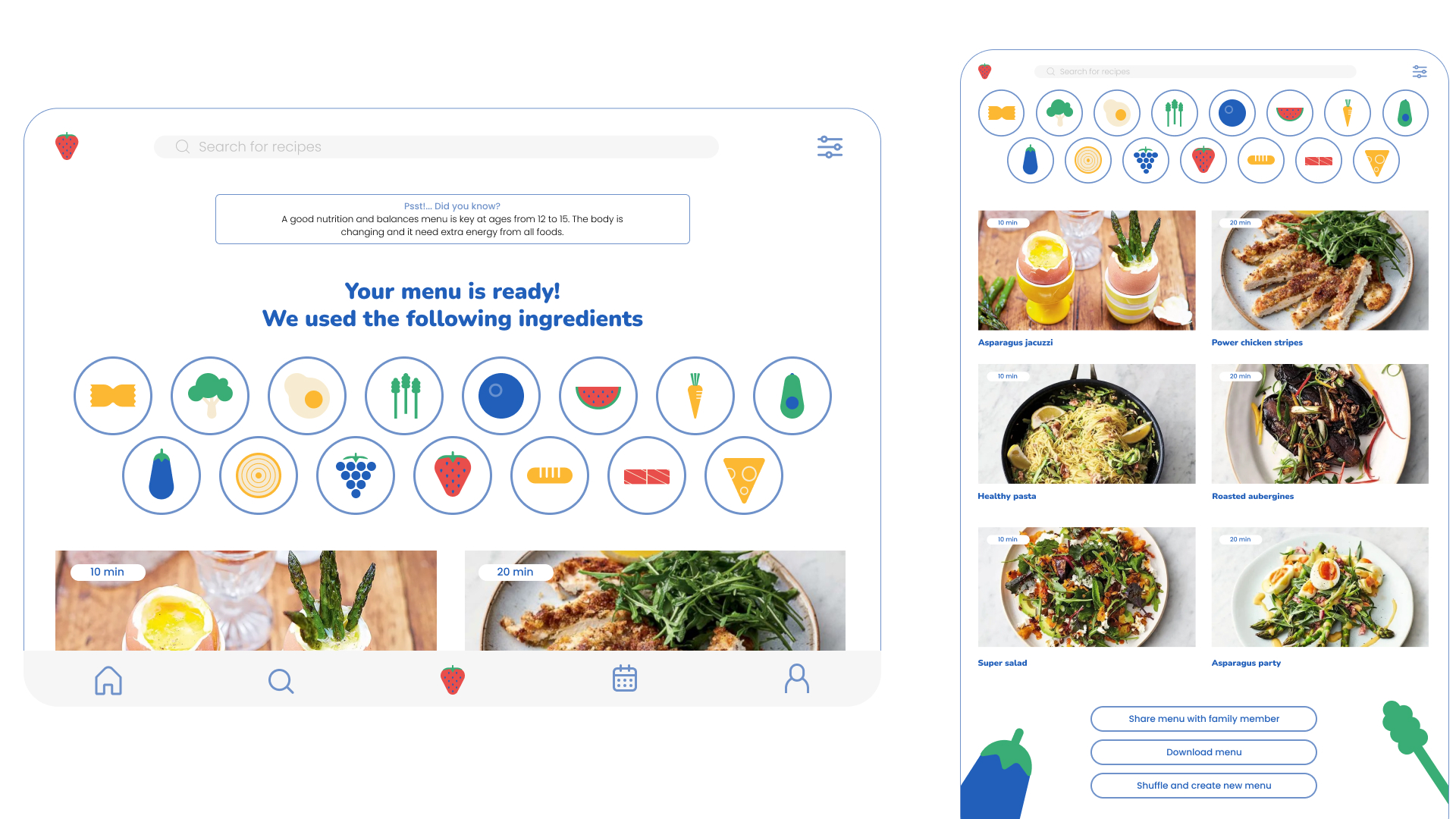
Nomnomnom is a healthy recipe service app that helps busy parents prepare delicious, healthy home cooked meals.
PROJECT
Personal Project
2022


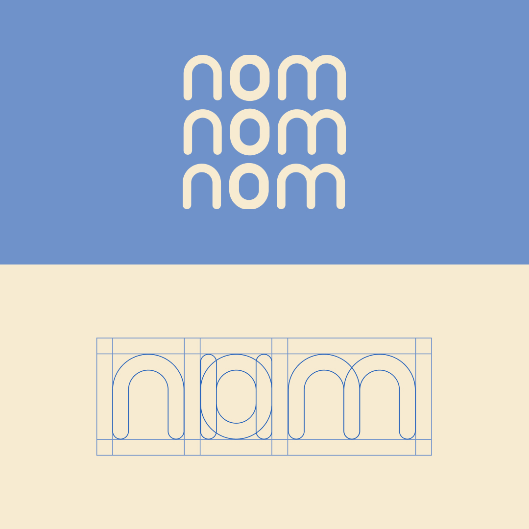
Logotype
This logo is made from one single shape used to form all letters.
It’s created this way to reinforce that Nomnomnom is an easygoing, intuitive brand, reliable, clear and trustworthy.
Concepts like minimal, reusable, time saving, affordable, home made and healthy are gonna be represented in every aspect of the brand, starting, of course, with our logo.
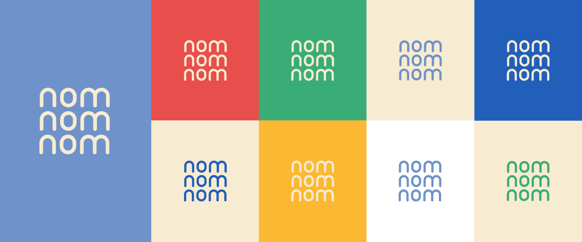
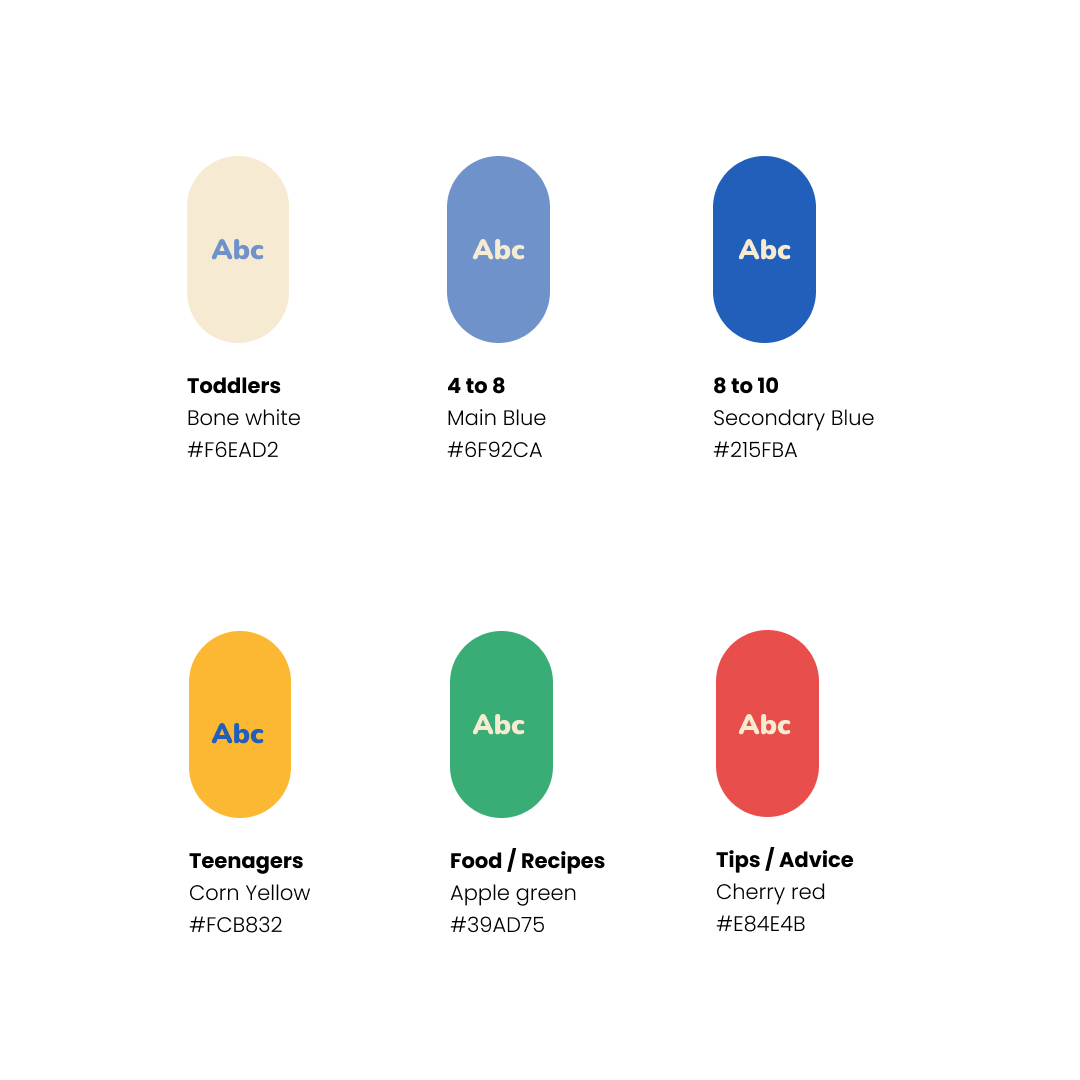
Color palette
It is very important that Nomnomnom’s values are represented in every aspect, that’s why the colors chosen for the brand are primary colors, familiar for everyone, they represent the simple and friendly times and together combined they create a cool and trendy style.
Nomnomnom’s app offers nutritional advice based on age group and physical developments.
Each color will represent a group age so parents can identify easily in which one their kid/s belong to. It will create a dialogue so they can find information fast and easily.
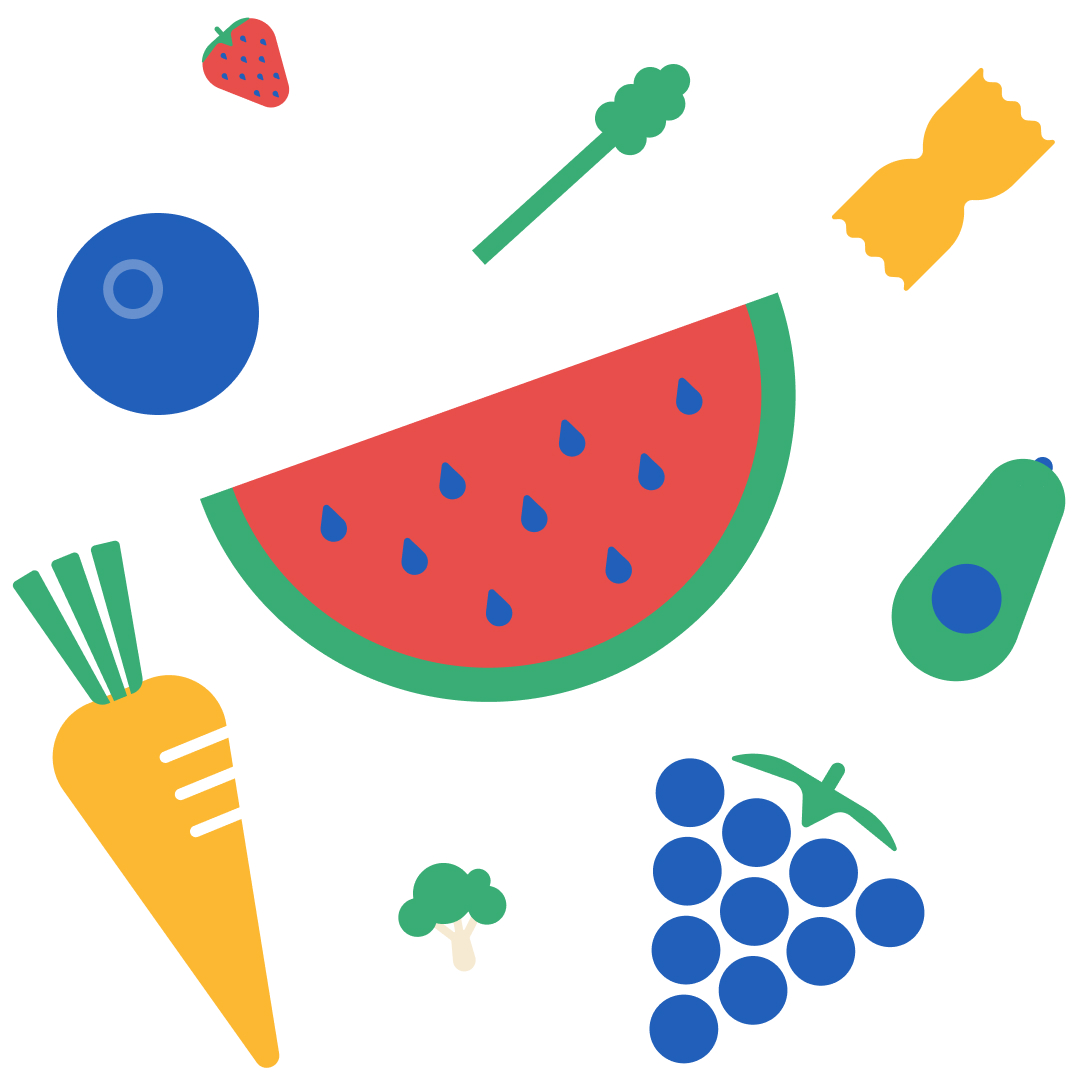
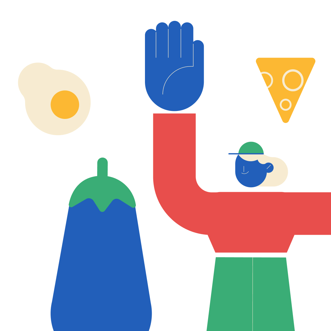
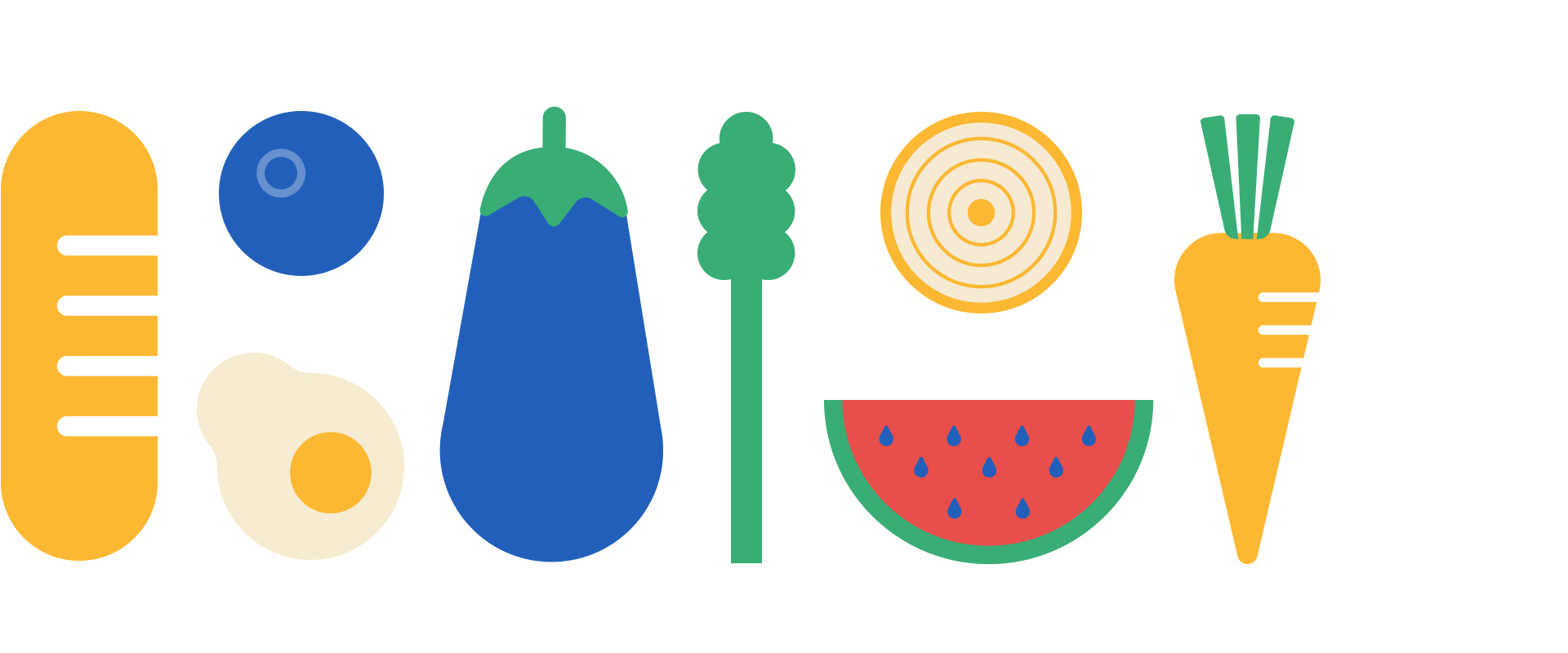
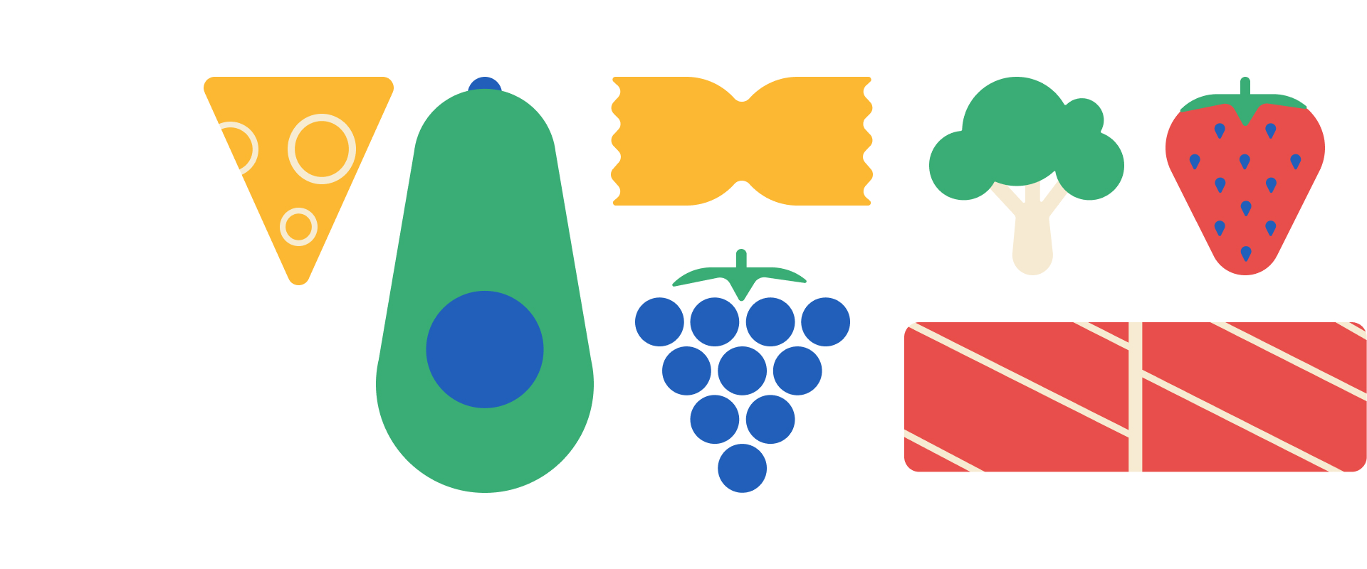
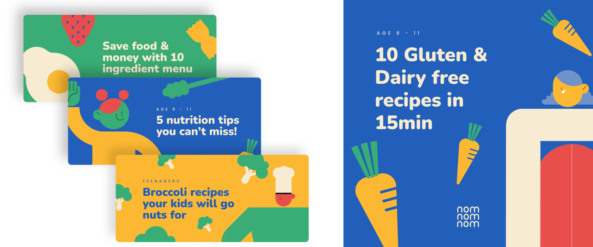
Illustration style
The illustration style also speaks about Nomnomnom’s values and purpose of the brand.
An attractive, eye-catching and colorful style that keeps its shapes geometric and flat. It represents the easy and comfy lifestyle that our costumers need to see due to their busy life and schedules.
Using this primary colors we can represent all foods and the also work for characters, making them inclusive.
The funny proportions make the style look friendly, playful and chilled.


Drop me a line!
© Copyright © 2023 Sara Mengual. All rights reserved.